Inside the Xplorr Console: A Walkthrough of the Demo Workspace
A screen by screen walkthrough of Xplorr, from connecting an account to a Kubernetes namespace bill. Every figure is seeded demo data, not a customer result.

Xplorr team
The people who build Xplorr
In this post
- What is actually in the demo workspace?
- How do you connect a cloud account?
- What does the first sync leave behind?
- Where does the cost breakdown land?
- How do you tell this month from last month?
- What does anomaly detection actually flag?
- What does a recommendation look like?
- What does the Kubernetes view show?
- What happens to spend that nothing owns?
- What this walkthrough is not
This walkthrough follows the Xplorr console from a first cloud account connection through to a Kubernetes namespace bill, with a screenshot at every step. Every screen here comes from our demo workspace, seeded with synthetic data for Lumidex Robotics, a fictional company. No customer data appears anywhere in it, and no figure below describes a real outcome.
Xplorr is in private beta, so there are no customer results to publish and we are not going to invent any. What we do have is a seed file in the repository, 002_demo_dataset.sql, that builds a complete multi-cloud workspace out of SQL. Every number quoted below is read off one of these screenshots or out of that seed file, and every one of them is labelled as demo workspace sample data right where it appears. None of them measures anybody’s bill.
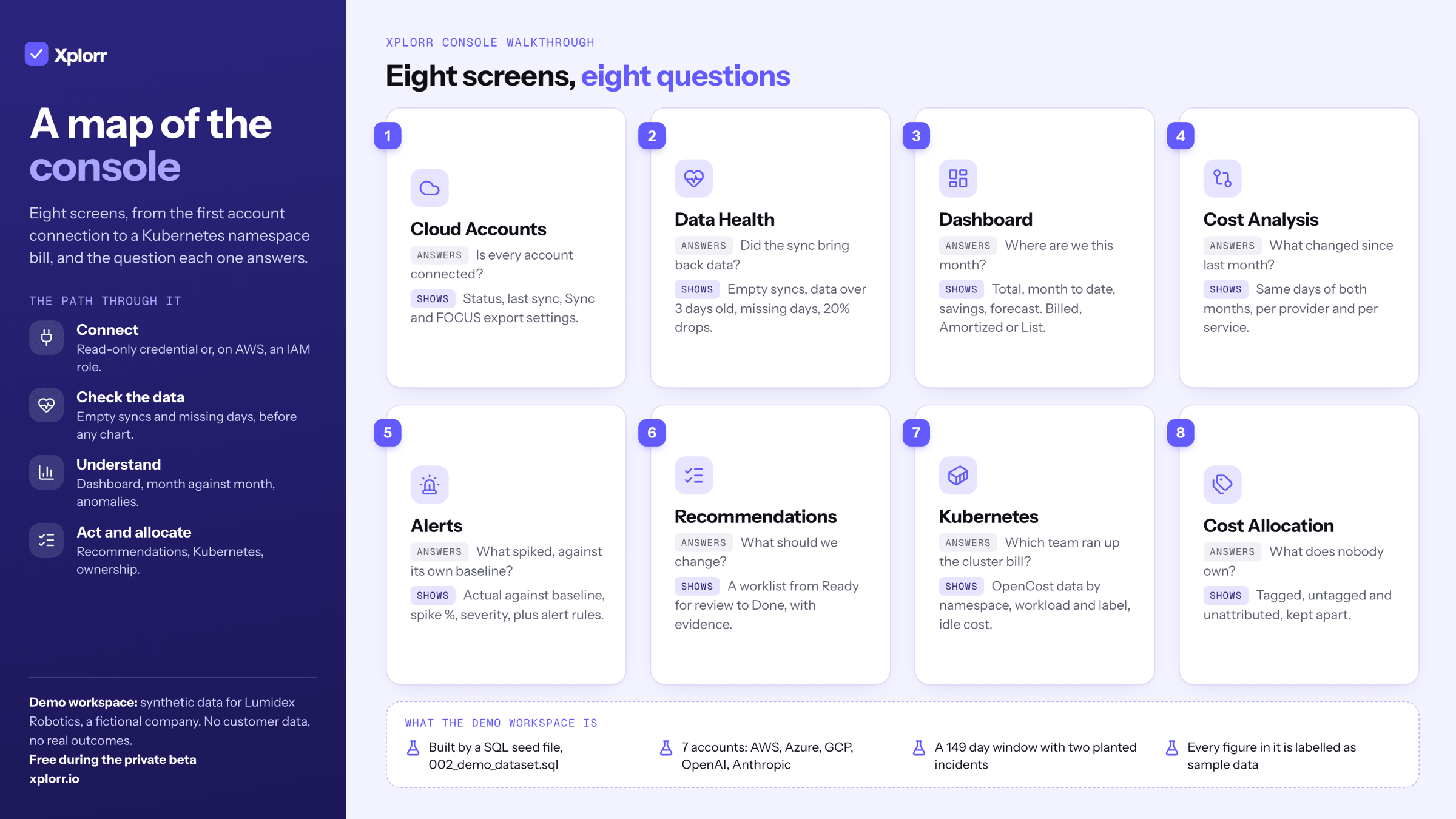
What is actually in the demo workspace?
Lumidex Robotics is invented. It is a fictional robotics company created for this dataset, with deliberately invalid account identifiers and email addresses on the reserved .example domain. The seed gives it seven cloud accounts across five providers: three AWS accounts for production, the data platform and a sandbox, one Azure subscription, one GCP project, and OpenAI and Anthropic connectors.
Across its 149 day window the seed generates roughly $274,000 of synthetic spend. That figure is produced by the SQL itself, not observed anywhere. The shape is deliberate too: AWS carries around 70 percent of it, weekends dip for elastic workloads, there is a mild upward trend, and two incidents are planted in the middle of the window so the anomaly detector has something real to catch. Dates are relative to the day the seed runs, so the workspace is always current.
How do you connect a cloud account?
Cloud Accounts is where a real account starts. You add one with Connect account, or several at once with Bulk import from a CSV. The form asks for a name, a provider, the account, subscription or project identifier, and a read-only credential pasted as JSON, which is encrypted with AES-256-GCM before it is stored. For AWS there is a second option the form marks as recommended: an IAM role Xplorr assumes, so no long lived key is handed over at all. Each saved account then carries a status and how long ago it last synced.
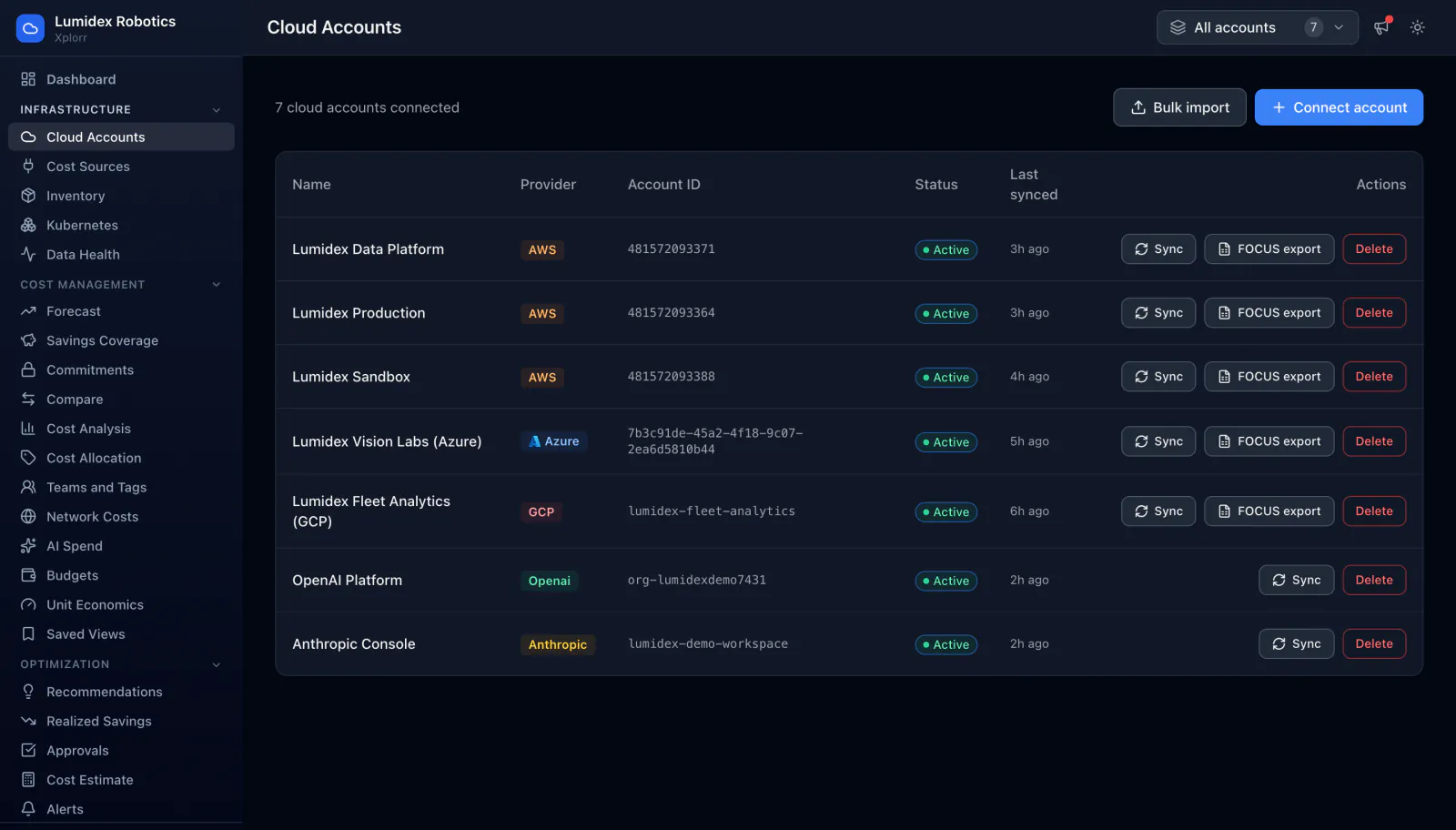
Three actions sit on each row. Sync triggers a pull outside the nightly schedule. FOCUS export opens the settings for the account’s own FOCUS billing export (the FinOps Open Cost and Usage Specification format), which Xplorr then reads from S3, Azure storage or BigQuery. Delete removes it. The two AI connectors in this demo workspace, OpenAI Platform and Anthropic Console, show Sync and Delete but no FOCUS export, because those providers do not publish billing data in a form that maps onto the spec.
What does the first sync leave behind?
A sync that silently returns nothing is worse than one that fails loudly, because the dashboard still renders. Data Health exists for that. It checks each account for syncs that return no data, cost data older than three days, missing days in the last 35 days, and daily totals that drop more than 20 percent after a sync.
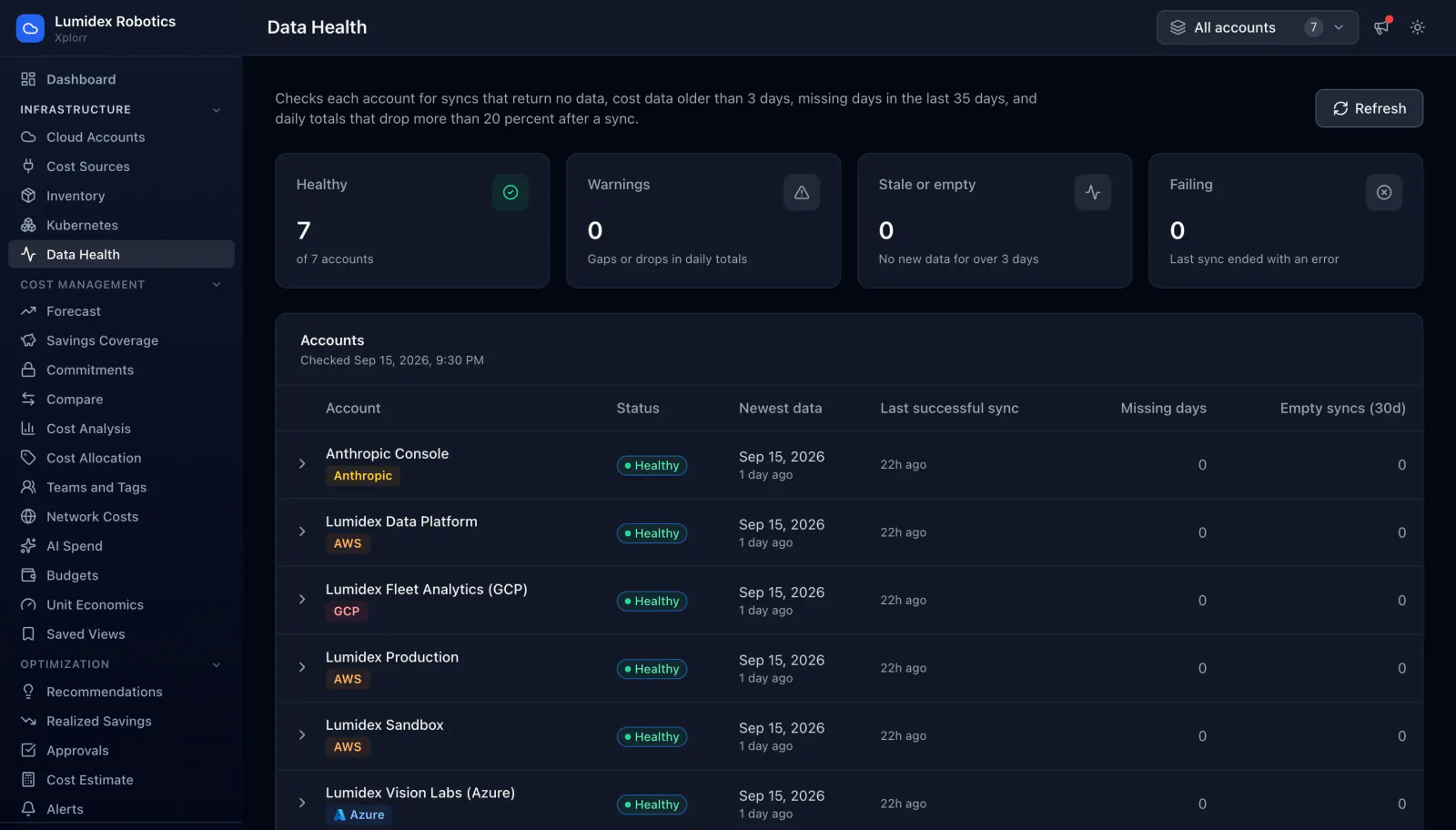
Four counters summarise it: Healthy, Warnings, Stale or empty, and Failing. Underneath, every account gets a row with its newest data date, the last successful sync, missing days and empty syncs over the last 30 days. In this demo workspace all seven accounts are healthy, which is what you would expect from generated data. On a real account the interesting rows are the ones that are not. Refresh recomputes the check on demand, and any row expands to show the last sync result, the exact dates that are missing, and a short list of what to look at first.
Where does the cost breakdown land?
The Dashboard is the default landing page, and it answers four questions before you scroll. In the demo workspace, seeded sample data, it reads: Total cost $62,189.76 over the last 30 days across 7 accounts, Month to date $30,638.17, Potential savings $3,336.80 from 11 open recommendations, and a 30-day forecast of $64,324.80.
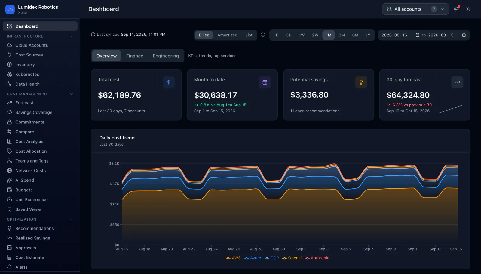
Below the cards, a daily cost trend stacks every provider in one chart. AWS, Azure, GCP, OpenAI and Anthropic share an axis, so model spend is never a separate spreadsheet. Three controls change what the numbers mean rather than how they look: Billed, Amortized and List switch the cost basis, a date range picker sets the window, and Overview, Finance and Engineering swap the KPI set for the audience reading it. Days whose billing is still arriving are drawn as a lighter dashed series and marked incomplete, so a half reported day is not read as a drop in spend.
How do you tell this month from last month?
A total on its own is not a signal. Cost Analysis puts month to date beside the same days of the previous month, so the comparison is like for like rather than a partial month against a full one.
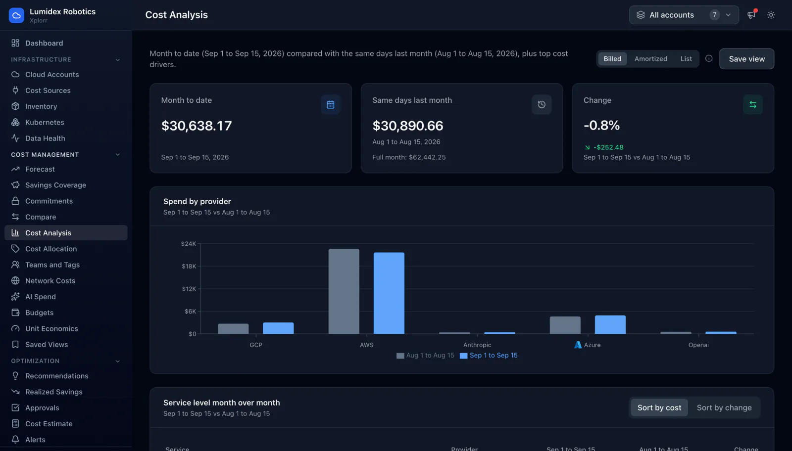
Underneath, Spend by provider draws both periods as paired bars, and a service level table lists every service with its current period, its prior period and the percentage change, sortable by cost or by change. In this demo workspace, sample data, the top row shows Amazon EC2 Compute at $6,789.17 against $8,541.24, down 20.5 percent. That is the view where a service that quietly doubled stops being invisible, because you never had to build a report to find it. A charge category panel further down separates plain usage from tax, credits, commitments, support and marketplace fees, which move for reasons that have nothing to do with engineering. Any arrangement of this page can be stored as a saved view.
What does anomaly detection actually flag?
Fixed thresholds fail in both directions: too high and nothing fires, too low and everything does. Alerts compares each service against its own baseline instead, so the threshold is derived per service rather than guessed once for the whole bill. How that baseline is built is on the anomaly detection page.
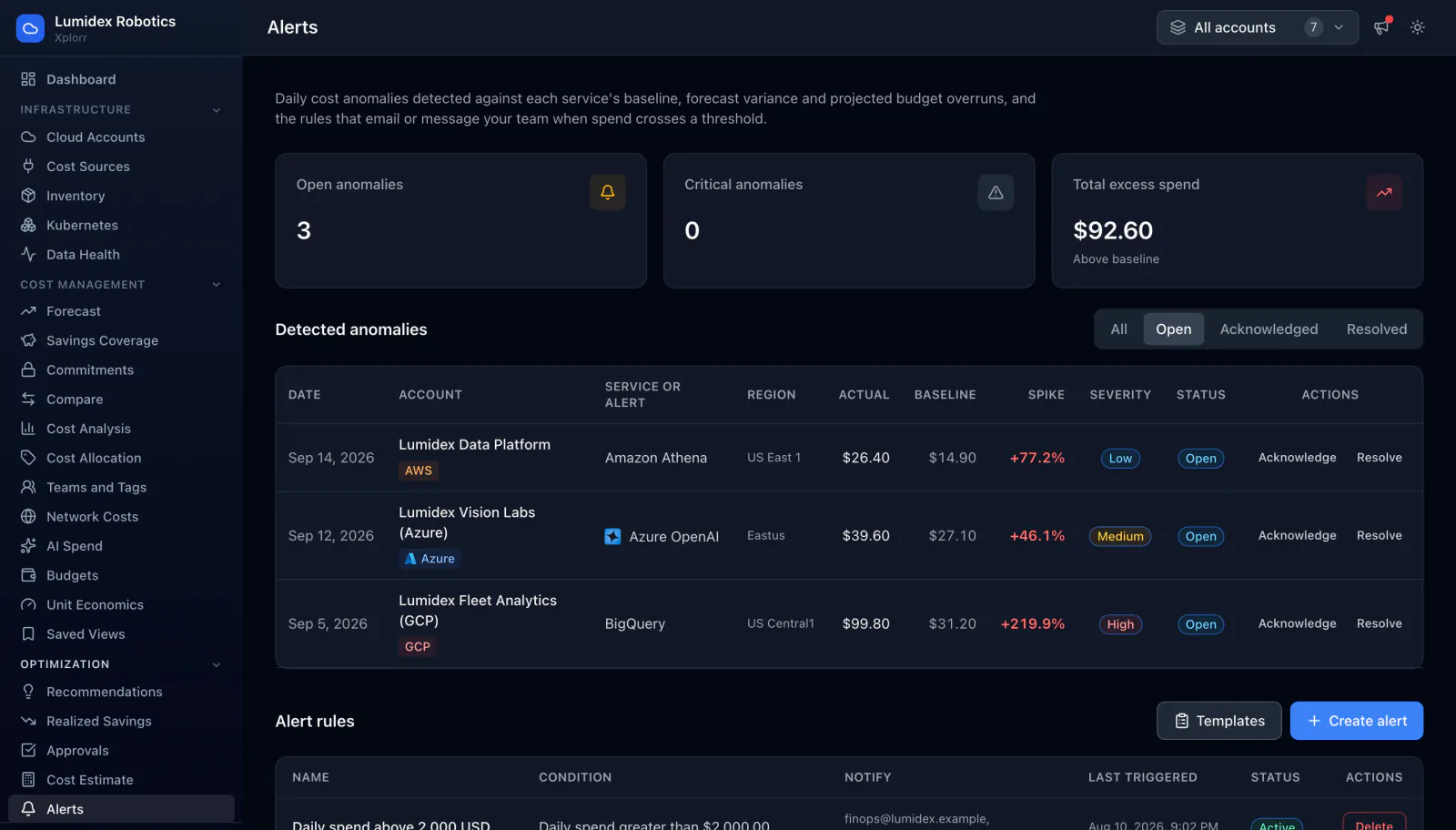
Every detection carries its evidence. In this demo workspace, synthetic data, the three open rows are BigQuery in us-central1 at $99.80 against a $31.20 baseline, a 219.9 percent spike marked High; Azure OpenAI at $39.60 against $27.10, up 46.1 percent, Medium; and Amazon Athena at $26.40 against $14.90, up 77.2 percent, Low. Each can be acknowledged or resolved. Below the table, alert rules cover the cases a baseline cannot. A rule picks a metric, total cost, service cost, daily spend or monthly forecast, then a greater than, less than or percent increase condition, a threshold, and the addresses or Slack webhook to notify.
What does a recommendation look like?
Recommendations is a worklist rather than a report. Four counters sit at the top, and in this demo workspace, seeded sample data, they read: $3,336.80 potential savings per month if applied, a 5.5 percent savings rate against the last 30 days of spend, 3 done, and 11 ready for review.
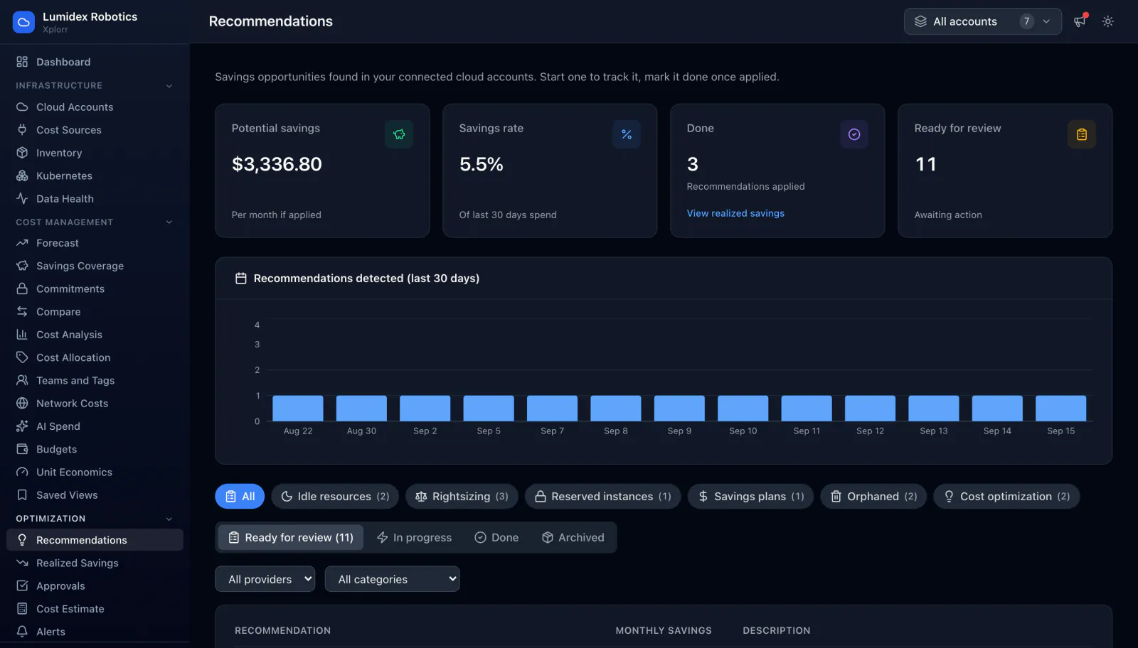
Filter chips split the list by category: idle resources, rightsizing, reserved instances, savings plans, orphaned and cost optimization. Status tabs move an item from Ready for review through In progress to Done or Archived, so what was actually applied stays visible afterwards. Every row carries the evidence next to the money. The top one in this sample data reads “Resize vision-train-gpu-01 from NC6s v3 to NC4as T4”, $712.80 a month, because GPU utilisation peaks at 34 percent during training windows. Expanding it shows the resource identifier and numbered remediation steps with a command you can copy.
What does the Kubernetes view show?
A cluster shows up on the cloud bill as instance hours, which tells you nothing about which team caused them. The Kubernetes page reads allocation data from OpenCost and splits the cluster cost by namespace, workload and label. The Kubernetes feature page explains where each of those numbers comes from.
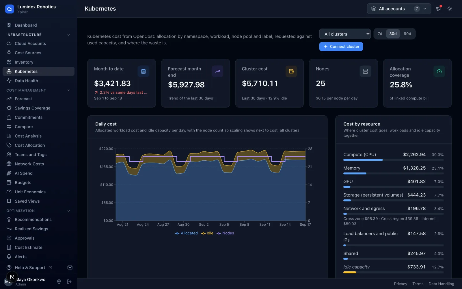
Five figures head the page, and in this demo workspace, sample data, they read $3,421.83 month to date, a $5,927.98 forecast for month end from the trend of the last 30 days, $5,710.11 of cluster cost over those 30 days at 12.9 percent idle, 25 nodes costing $6.15 per node per day, and 25.8 percent allocation coverage of the linked compute bill. That last one is the honest counter: it says how much of the compute bill the allocation data actually explains. The daily chart draws the node count over the cost, so a scaling event and the bill that followed it sit on the same picture. Cost by resource splits the same total into CPU, memory, GPU, storage, network with its cross zone and cross region parts, load balancers, shared cost and idle capacity. Below that the breakdown table splits by namespace, controller, pod, node, node pool or label, and further panels cover requested against used capacity, over provisioned workloads, node pools, unused persistent volumes and commitment coverage.
What happens to spend that nothing owns?
Cost Allocation splits spend by the tags you already have, and then, more usefully, reports what it could not split. Tagged, untagged and unattributed are three different problems and the page keeps them apart.
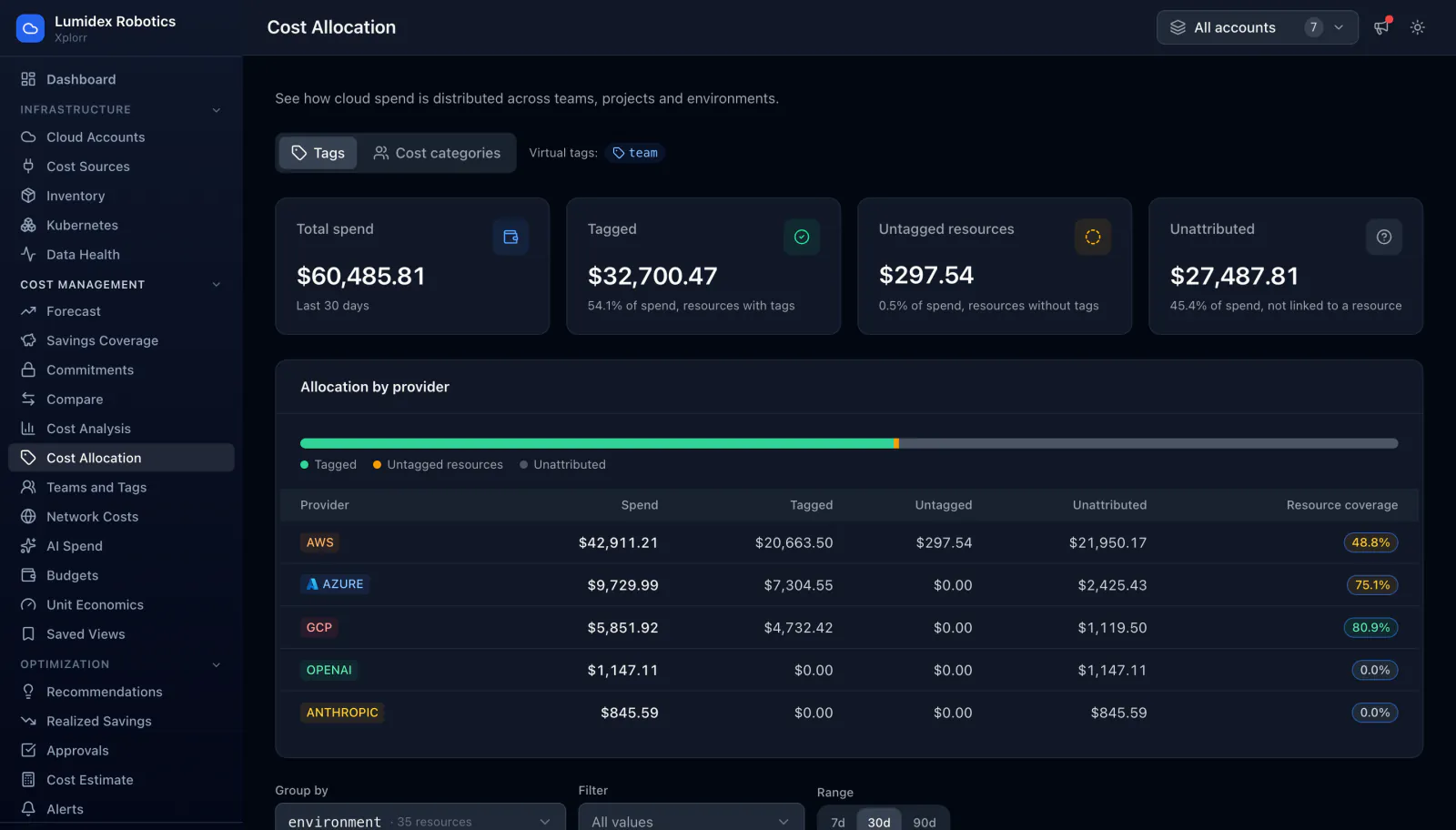
In this demo workspace, seeded sample data, $60,485.81 of 30 day spend splits into $32,700.47 tagged at 54.1 percent, $297.54 untagged at 0.5 percent, and $27,487.81 unattributed at 45.4 percent. Unattributed means the charge never mapped to a resource at all, which is where support fees, tax, shared discounts and per-request API spend land. The per provider table carries a resource coverage figure for each: 48.8 percent for AWS, 75.1 for Azure, 80.9 for GCP, and zero for both AI connectors, which bill at the organisation level and expose no resources to tag. A group by control swaps the split to any tag key, a virtual tag that merges duplicate keys, or a cost category built from rules.
What this walkthrough is not
It is not a case study. Lumidex Robotics does not exist, nobody ran these workloads, and nothing here was saved, because there was nothing to save. Every dollar figure above is a value computed by a seed file and then screenshotted, which is why each one is labelled as demo workspace sample data next to the number rather than once at the top.
Two further caveats. The seed generates dates relative to the day it runs, so these totals belong to one particular capture and will not match a demo you see later. And a populated workspace shows what the screens do with data; it says nothing about your own bill. The product tour uses the same workspace and carries the same label.
Related reading:
Written by
Xplorr team
The people who build Xplorr
Written together by the engineers who build Xplorr: the AWS, Azure, GCP and Kubernetes collectors, the console, and the alerting behind them.
About Xplorr