See what Xplorr looks like inside
Nine screens from the console, captured as they ship. Every figure on them comes from a demo workspace seeded with synthetic data for a fictional company, spending roughly $60K a month across AWS, Azure, GCP, OpenAI and Anthropic. The numbers are consistent from one screen to the next because they are generated together, not because anyone measured them.
Overview
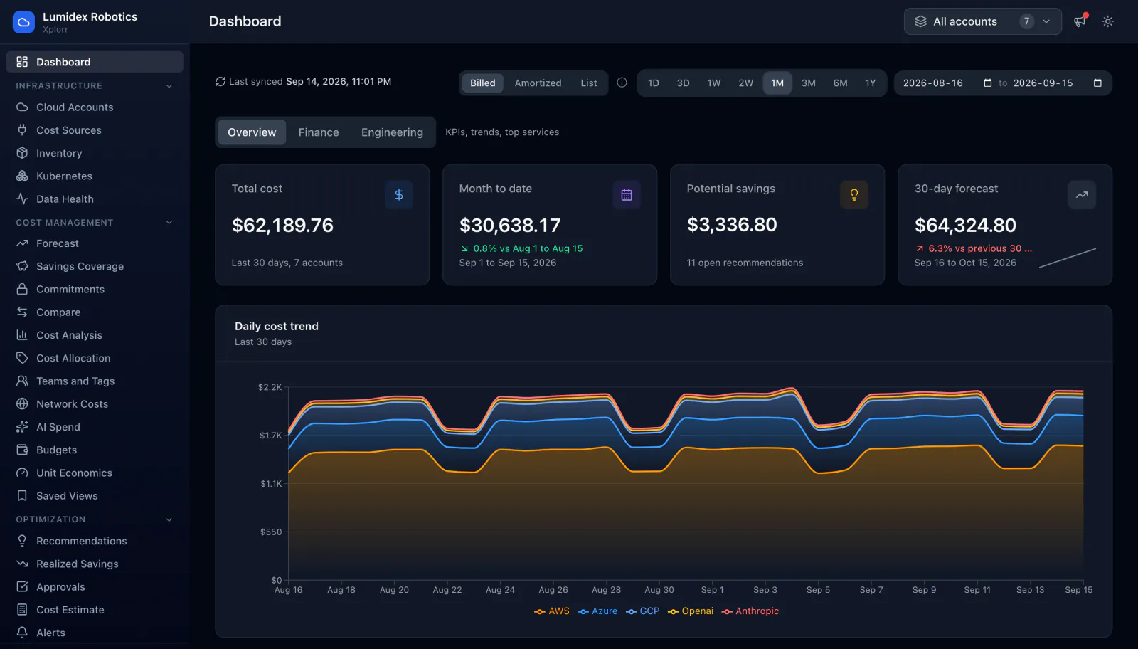
Dashboard overview
Total cost, month to date, potential savings and a 30 day forecast across every connected account, with a daily cost trend stacked by provider. OpenAI and Anthropic sit in the same chart as AWS, Azure and GCP, so the model bill is never a separate spreadsheet.
Cost Data
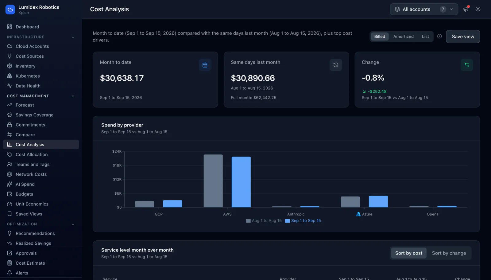
Cost analysis, month over month
This month against the same days last month, by provider and by service. Because both periods sit in the same table with the change beside them, a service that quietly doubled is obvious without building a report first.
Anomaly Detection
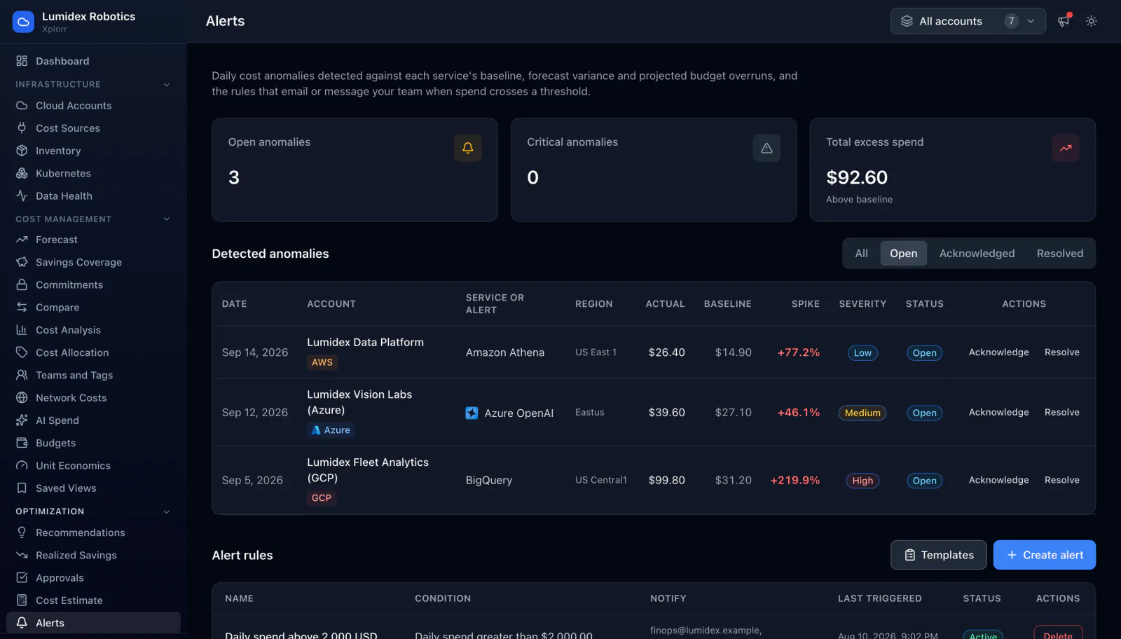
Anomaly detection and alert rules
Each service is compared against its own baseline, so you do not have to guess a threshold per service. Every anomaly carries the account, service, region, actual against baseline cost, the size of the spike and a severity, and can be acknowledged or resolved.
Optimization
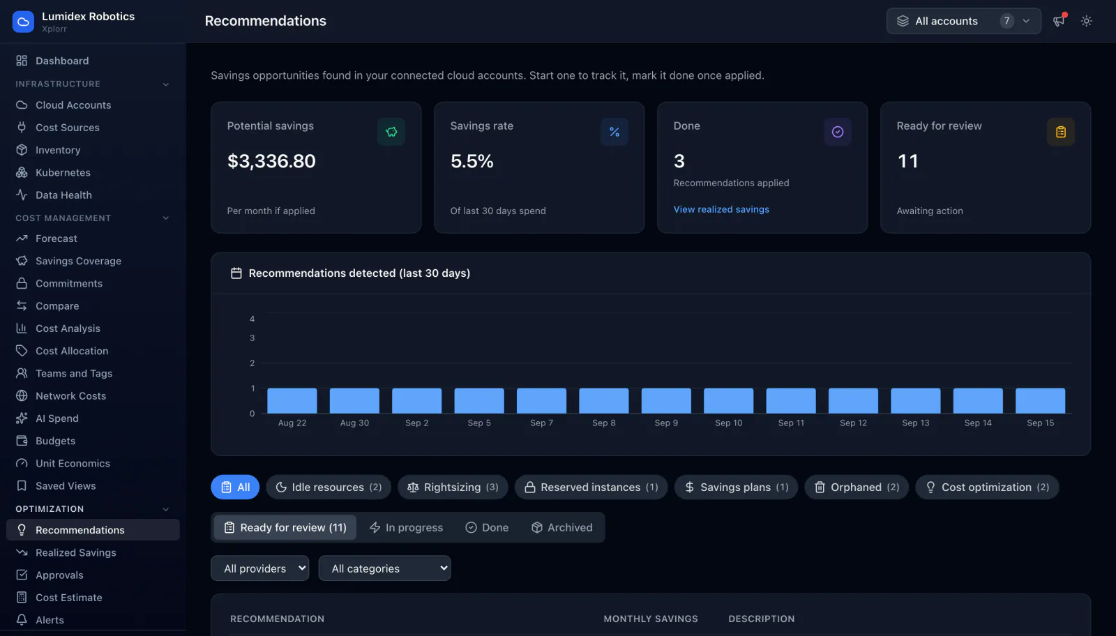
Recommendations
Savings opportunities grouped by idle resources, rightsizing, reserved instances, savings plans and orphaned resources. Each row shows the monthly figure and the evidence behind it, and moves from ready for review through to done so you can see what was actually applied.
Allocation
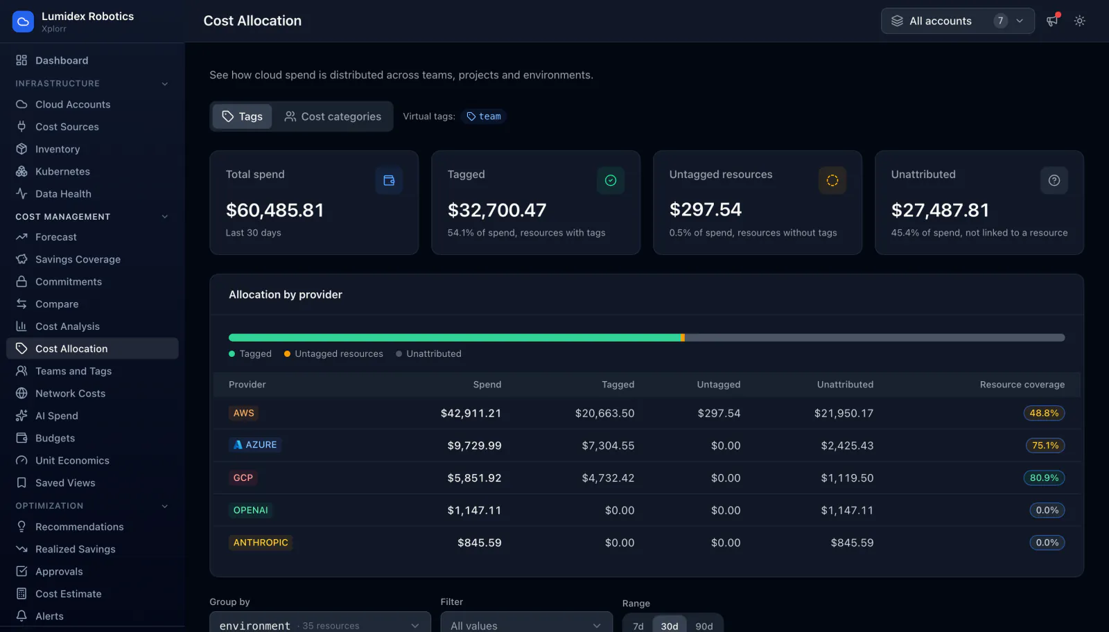
Cost allocation by team and tag
Spend split across teams, projects and environments using the tags you already have. The honest part is the rest of the picture: how much is untagged, how much cannot be attributed to a resource at all, and what tag coverage looks like per provider.
Budgets
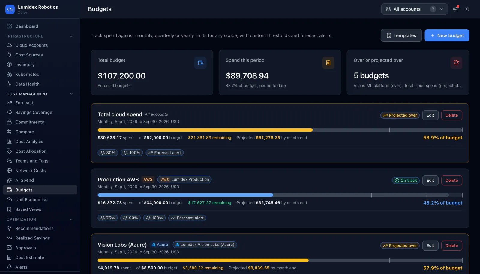
Budget tracking
Budgets scoped to an account, a provider or the whole organisation, each with spend to date, what is left and a projection for month end. A budget on pace to overshoot is marked as projected over while there is still time to do something about it.
Forecasting
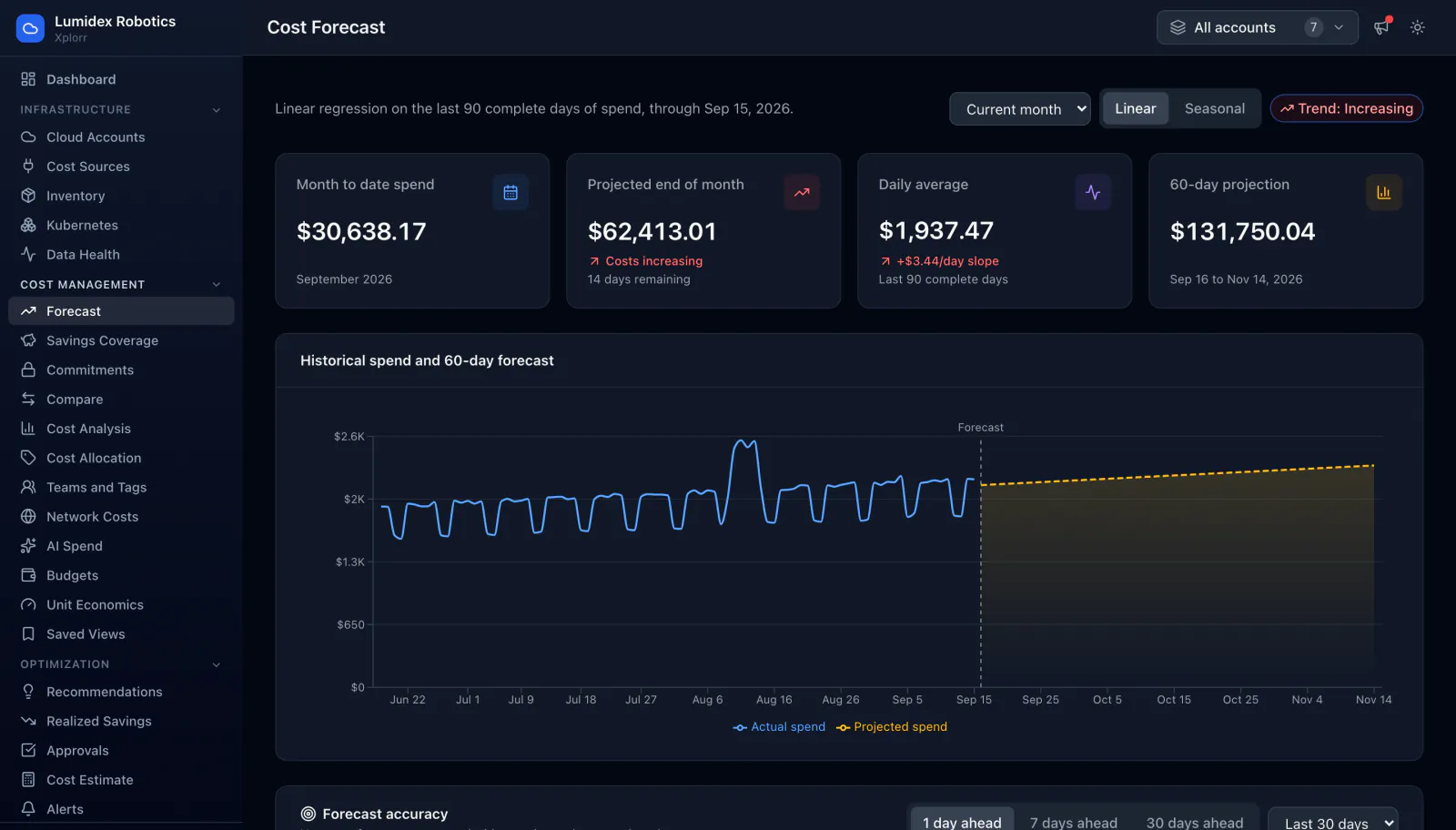
Cost forecast
A linear regression over the last 90 complete days, projected to month end and 60 days out, with the daily slope shown alongside it. Xplorr also reports its own accuracy, comparing past forecasts against what actually landed at 1, 7 and 30 days ahead.
Network Costs
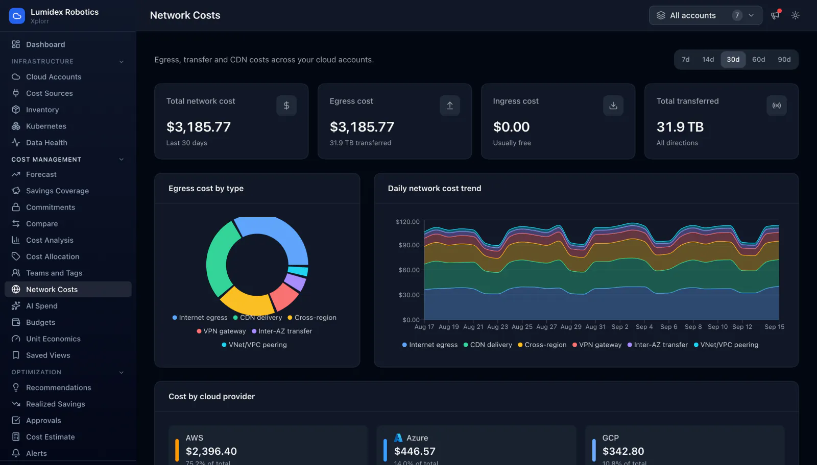
Network and data transfer costs
Data transfer is easy to miss because it is spread across services rather than billed as one line. Xplorr splits egress by type, internet, CDN delivery, cross region, VPN gateway, inter-AZ and VPC peering, then shows the daily trend and which provider it came from.
AI Spend
AI and model spend
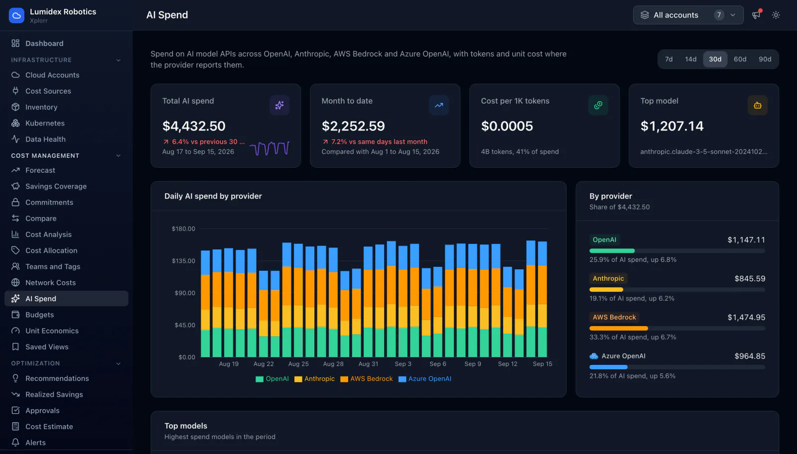
OpenAI, Anthropic, AWS Bedrock and Azure OpenAI tracked in the same place as the cloud bill, with tokens and cost per thousand tokens where the provider reports them, plus a breakdown by model so an expensive default is easy to spot.
Outside the console
Where your team already works
Most cost questions get asked in chat, not in a dashboard. Xplorr answers them there instead of waiting for someone to log in.
Slack
A daily cost digest and a Monday summary in your channel, anomaly, budget and credit alerts when the daily checks find them, and a bot that answers cost questions in plain English. Microsoft Teams is in development.
MCP for AI assistants
Xplorr ships an MCP server, so an AI assistant can query your cost data directly and answer a question like why S3 jumped last week with the actual numbers behind it rather than a guess.
Ready to see your own data?
Connect your first cloud account and these same screens fill up with your costs instead of the demo workspace. Start free, no credit card required.