Put two periods side by side without doing the arithmetic
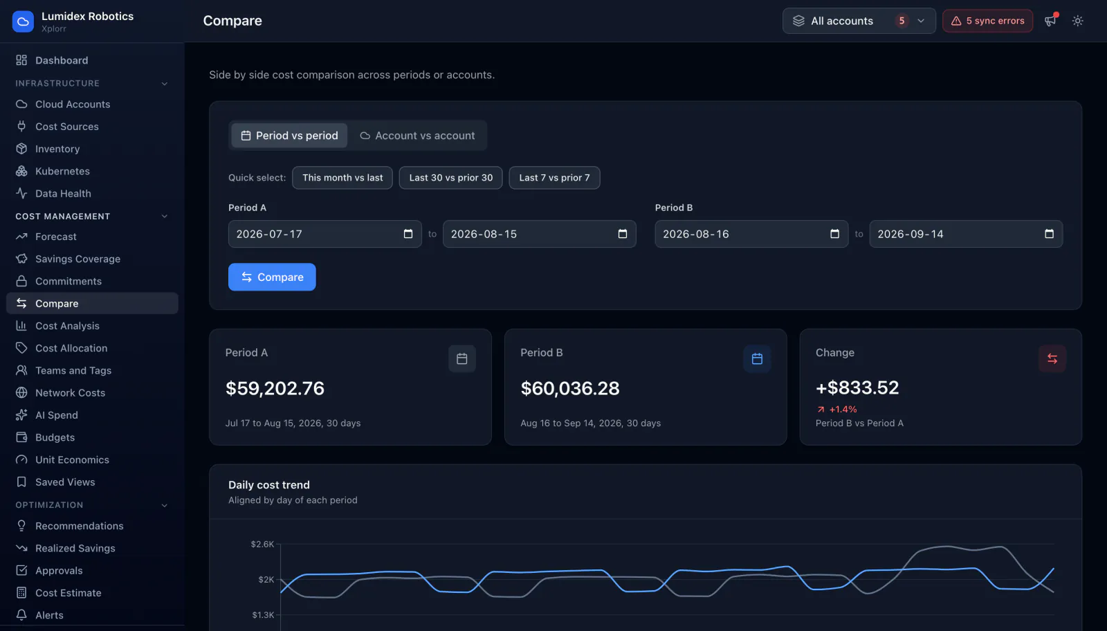
Answering what changed usually means exporting two ranges and lining them up in a spreadsheet. Compare takes two date ranges, or two accounts over the same range, and returns the total for each side, the difference in both currency and percent, a daily trend aligned day by day, and the change broken down per service and per account.
Inputs
Where the Compare numbers come from
Xplorr reads your accounts with read only credentials and never writes to your infrastructure. These are the sources behind this screen.
- Daily cost per service and account
- Both sides of a comparison read the same stored daily cost data as the rest of Xplorr, so a figure here matches the same range on the cost analysis page rather than being computed by a separate path.
- The two windows you pick
- A comparison is defined by two explicit date ranges, or by two accounts over one range. Nothing about which periods are interesting is assumed on your behalf.
- Account and service attribution
- Each cost line already carries the account that was billed and the service that produced it, which is what allows the difference to be attributed rather than just totalled.
Method
How the Compare numbers are worked out
No black box. If a figure is an estimate or an apportionment rather than a billed line, the page says so.
The presets build equal length, non overlapping windows
Last 30 against prior 30, and last 7 against prior 7, produce two windows of the same length that do not share any days. Overlapping ranges would count the shared days on both sides and make the difference meaningless.
A month comparison clamps to the shorter month
This month against last month has to handle the 31st existing on one side and not the other. The day is clamped to the length of the earlier month rather than silently dropping or duplicating a day.
The trend is aligned by day of period, not by date
The daily chart lines up day one of period A against day one of period B, so two ranges of the same length can be read against each other directly even though their calendar dates differ.
A new line item is reported as new, not as an infinite increase
When a service cost nothing in the first period, there is no percentage change to compute. Rather than printing an infinity or a misleading zero, the row is marked as new, which is the accurate description of what happened.
Change is shown in currency and percent together
Both figures sit on the same row because either one alone misleads. A large percentage on a tiny base is noise, and a small percentage on the biggest service is usually the whole story.
In the console
What is on the Compare screen
- A period against period mode and an account against account mode
- Quick presets for this month against last, last 30 against prior 30, and last 7 against prior 7
- Explicit start and end dates for both sides, editable directly
- The total for each side with its date range and day count
- The change between them in currency and as a percentage
- A daily cost trend with both periods aligned by day of period
- A per service table and a per account table, each showing both sides and the change
Common questions about Compare
Why do the presets avoid overlapping windows?
What happens when a service is new in the second period?
Can I compare two accounts instead of two dates?
How is this different from the month over month table on Cost Analysis?
Background reading
A monthly review built around period comparisons is one of the habits in FinOps best practices for engineering teams.
Related features
How this compares
See this on your own accounts
Connect a cloud account with read only credentials and the first sync pulls your last 30 days, so this screen fills with your numbers instead of the demo workspace. Free during beta.