Turn total spend into cost per customer, order or request
Total cloud spend going up is not automatically bad news. It is only bad if it is going up faster than the thing it supports. Xplorr takes a scoped slice of your cloud spend, divides it by a metric you send, and charts the resulting cost per unit over time so growth and waste stop looking the same.
Inputs
Where the Unit Economics numbers come from
Xplorr reads your accounts with read only credentials and never writes to your infrastructure. These are the sources behind this screen.
- Your cloud spend, scoped
- The numerator is ordinary Xplorr cost data narrowed to the accounts, services or tags that belong to the metric, so a per customer figure is not inflated by infrastructure that has nothing to do with serving customers.
- Metric values you send
- The denominator comes from you, because only your systems know how many customers, orders or requests there were. Values are sent per period and stored as a series.
- Effective cost
- Spend is taken on an effective amortized basis, so a commitment paid for up front is spread across the periods it covers instead of spiking the month it was bought.
Method
How the Unit Economics numbers are worked out
No black box. If a figure is an estimate or an apportionment rather than a billed line, the page says so.
Scoped cost is divided by the metric value for the same period
Cost per unit is computed per period rather than once over the whole range, which is what lets the chart show the ratio moving instead of a single average.
Incomplete periods are marked, not averaged in
Billing data arrives with a lag. A period still filling up is flagged as partial and the headline figure is taken over complete days only, so the most recent bar does not look like a sudden improvement.
Coverage of the series is reported
The page states how many periods actually had a metric value out of how many were in range. A cost per unit built on half the periods is a different claim from one built on all of them, and it says which you are looking at.
Trend compares halves of the range
The trend figure compares the second half of the selected range against the first, which is a more stable read than the change between the last two points.
In the console
What is on the Unit Economics screen
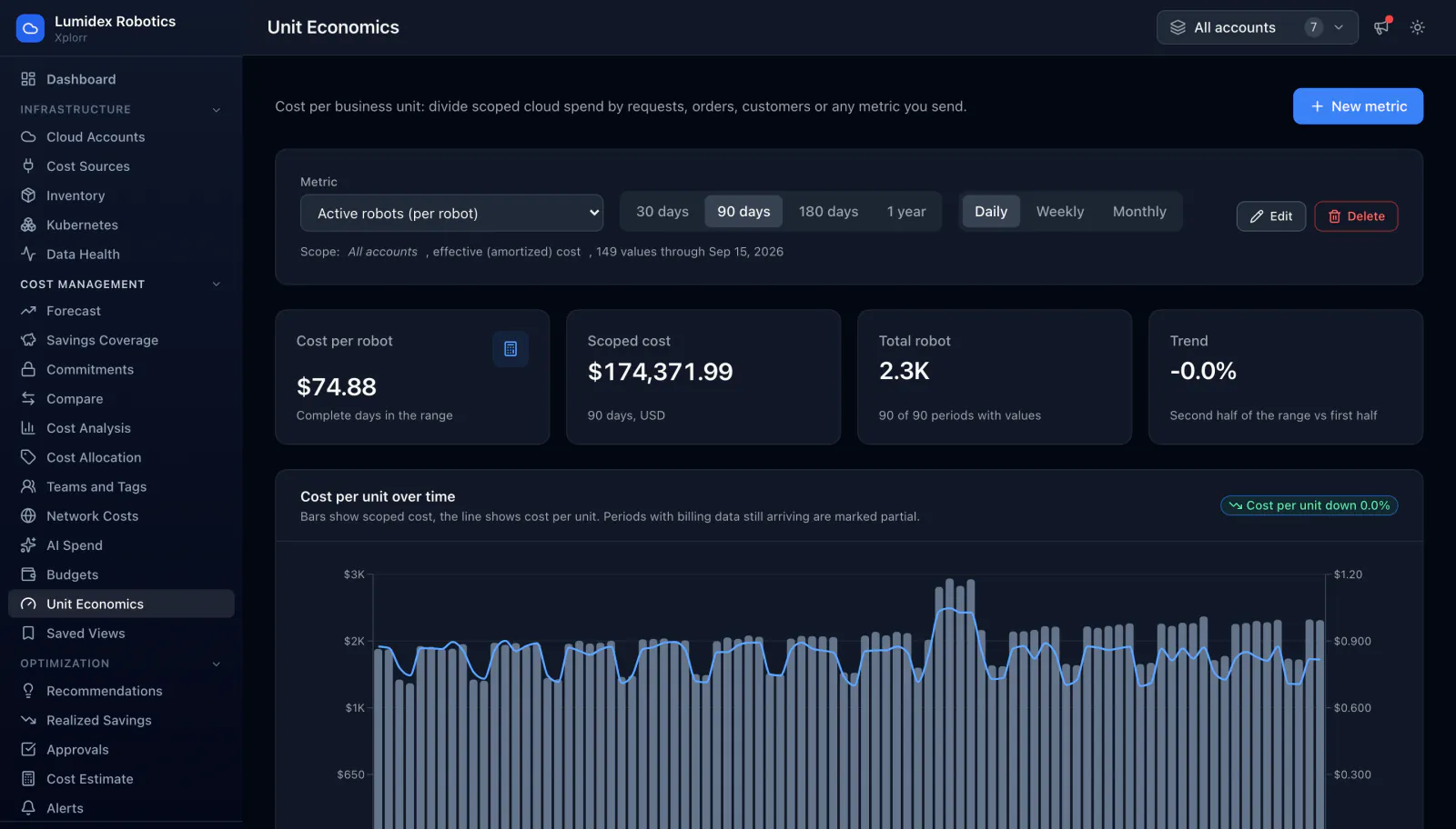
- Cost per unit for the selected metric, over complete periods in the range
- Scoped cost and total units behind that ratio, with the currency and window stated
- How many periods carried a value, out of the number in range
- Trend of the second half of the range against the first
- A combined chart with scoped cost as bars and cost per unit as a line
- Daily, weekly or monthly granularity over 30, 90 or 180 days or a year
- Several metrics side by side, each with its own scope, created and edited in the console
Common questions about Unit Economics
What metric should I use?
Where do the metric values come from?
Why is my most recent period marked partial?
Background reading
When cost per customer starts to matter as a company grows is covered stage by stage in Cloud cost optimization for startups.
Related features
How this compares
See this on your own accounts
Connect a cloud account with read only credentials and the first sync pulls your last 30 days, so this screen fills with your numbers instead of the demo workspace. Free during beta.