Compare equal periods, not a part month against a whole one
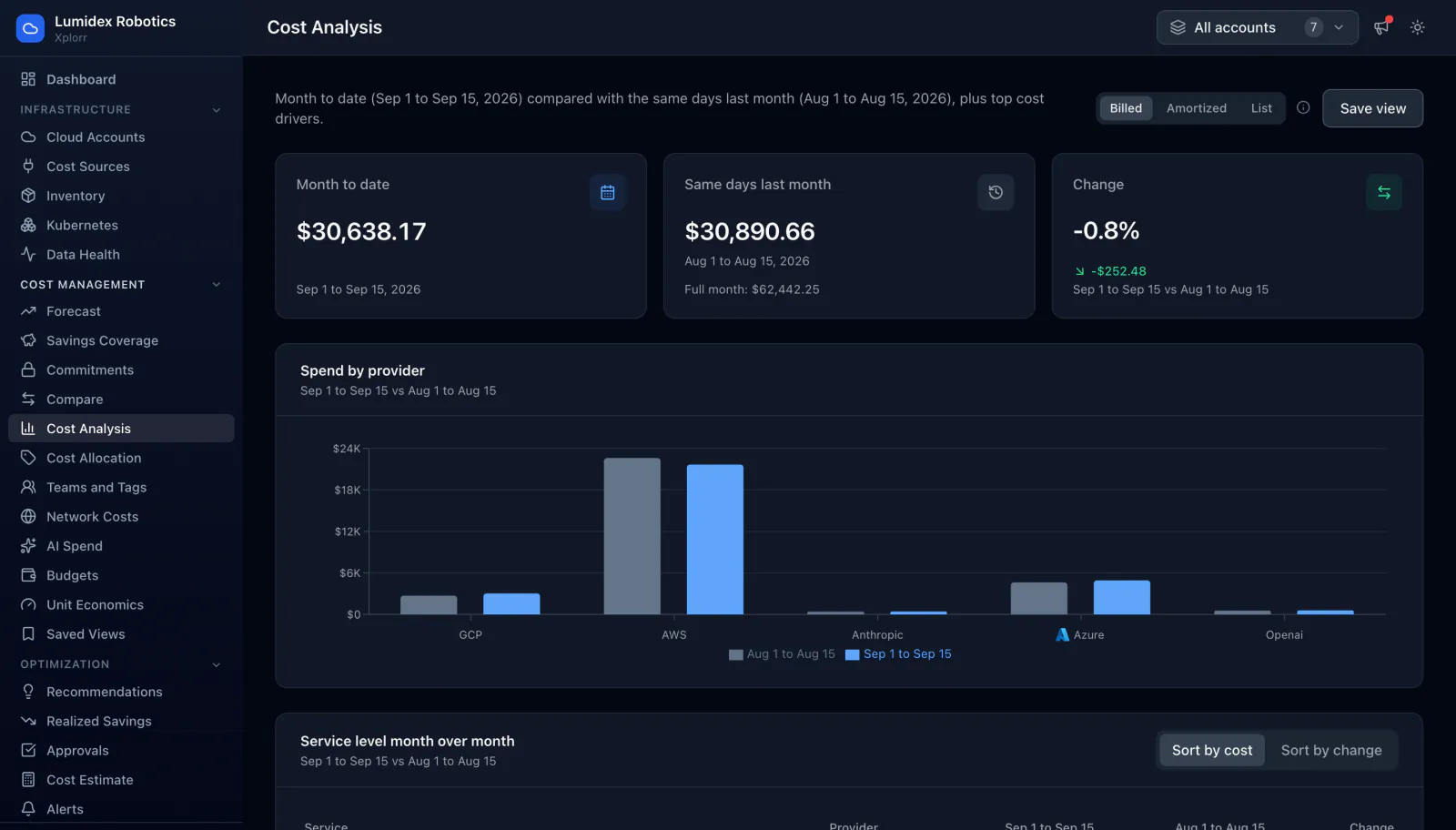
Month to date against last month is the comparison most billing consoles get wrong, because 15 days of spend always looks better than 31. Cost Analysis compares month to date with the same days of the previous month, shows the full previous month separately for context, and ranks every service by what it cost and by how much it moved.
Inputs
Where the Cost Analysis numbers come from
Xplorr reads your accounts with read only credentials and never writes to your infrastructure. These are the sources behind this screen.
- Daily cost per service and account
- Cost comes from AWS Cost Explorer, Azure Cost Management and the GCP billing export, synced daily per service, account and region, which is the granularity that makes a service level ranking possible.
- AI provider usage
- OpenAI and Anthropic spend is pulled into the same totals as the three clouds, so a provider comparison covers what you actually spend rather than only the infrastructure part of it.
- The same stored data every other page reads
- Cost Analysis does not query a separate warehouse. It reads the daily totals that budgets, forecasting and allocation also read, so the figures reconcile across pages by construction.
Method
How the Cost Analysis numbers are worked out
No black box. If a figure is an estimate or an apportionment rather than a billed line, the page says so.
The comparison window is matched day for day
Month to date is compared with the same day range of the previous month. Comparing 15 days against 15 days is the only version of this number that means anything, and the full previous month is shown beside it rather than mixed into the comparison.
Billed, amortized and list are three different questions
Billed cost is what the invoice charged in that period. Amortized cost spreads an upfront commitment payment across the term it covers. List cost is what the same usage would have cost with no discount at all. Switching between them changes the answer, so the page makes the choice explicit rather than picking one silently.
Change is reported in both currency and percent
A percentage alone hides scale, and an absolute alone hides severity. A service up 200 percent on a $12 base is noise, and one down 20 percent on $8,500 is the month, so both figures sit on the same row.
Services can be ranked by cost or by movement
Sorting by cost answers where the money goes. Sorting by change answers what is different this month. These are rarely the same list, which is why the ordering is a control rather than a fixed default.
In the console
What is on the Cost Analysis screen
- Month to date total with its exact date range
- The same days of last month, plus that month full total for context
- Change against the matched period in both currency and percent
- A spend by provider chart with both periods side by side
- A service level table with each period, the change, and the provider that billed it
- A billed, amortized and list cost switch, and sorting by cost or by change
- An account selector, and a control to save the current filter set as a view
Common questions about Cost Analysis
Why compare against the same days rather than the whole of last month?
Which cost basis should I use?
Does this cover AI spend as well as cloud?
How current are the numbers?
Background reading
The case for one view across three billing consoles is made in Why multi-cloud cost visibility is broken.
Related features
See this on your own accounts
Connect a cloud account with read only credentials and the first sync pulls your last 30 days, so this screen fills with your numbers instead of the demo workspace. Free during beta.